Studio73
The Client
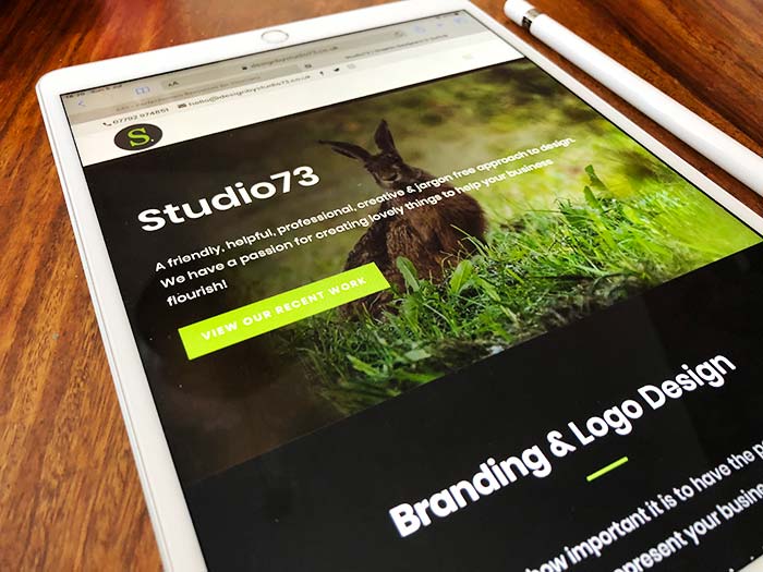
It is no surprise that as we are a Graphic Design agency that we would design our own logo and apply this branding across absolutely everything we use for the marketing and promotion of Studio73.
This is always the hardest project to get right and the worst client to work for lol!
The Project
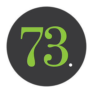
We wanted to keep things simple and create an icon with some impact. Originally we used the 'S' and a white heart as a full stop to compliment the dark grey colour palette with contrasting bright green accent.
We sometimes used the green heart as a standalone icon which, along with the white heart in the logo, represented our love of design.
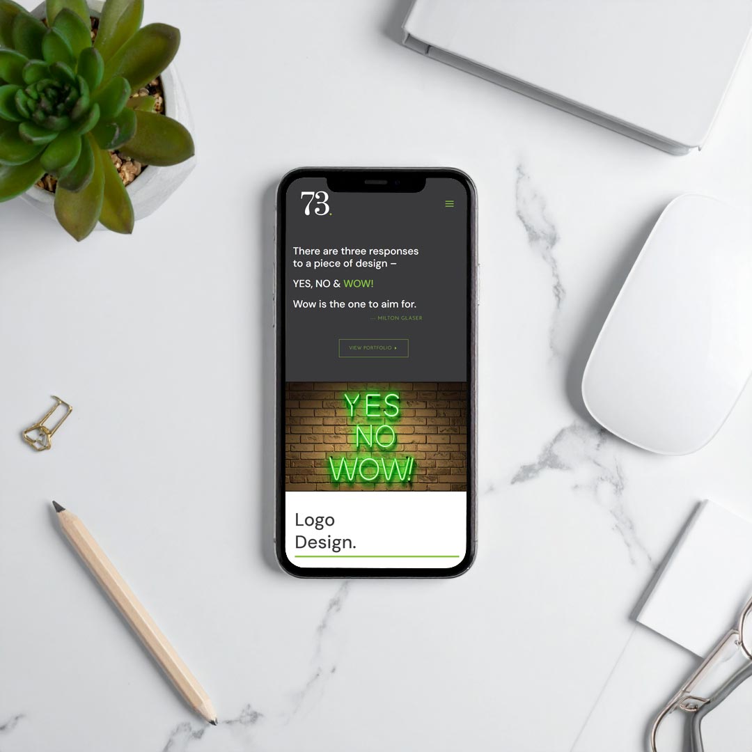
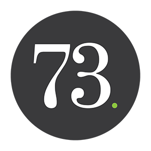
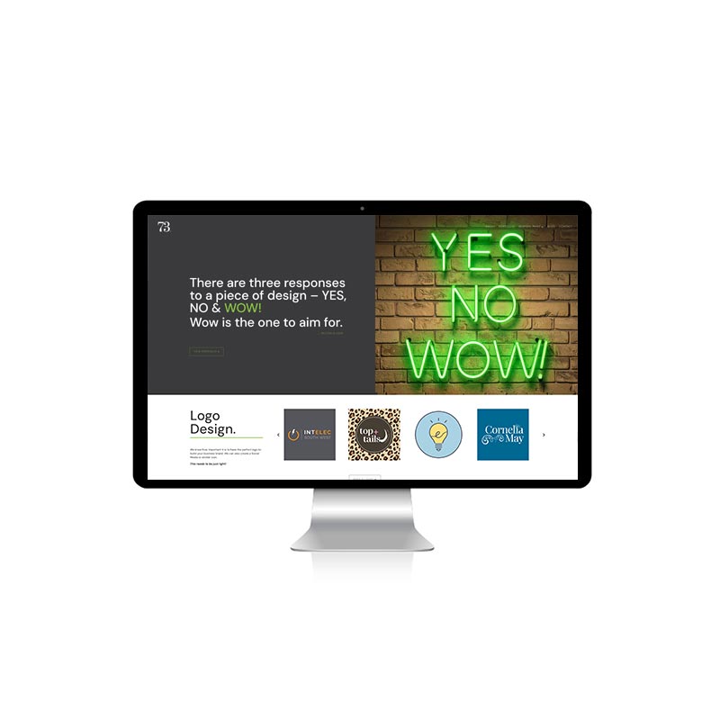
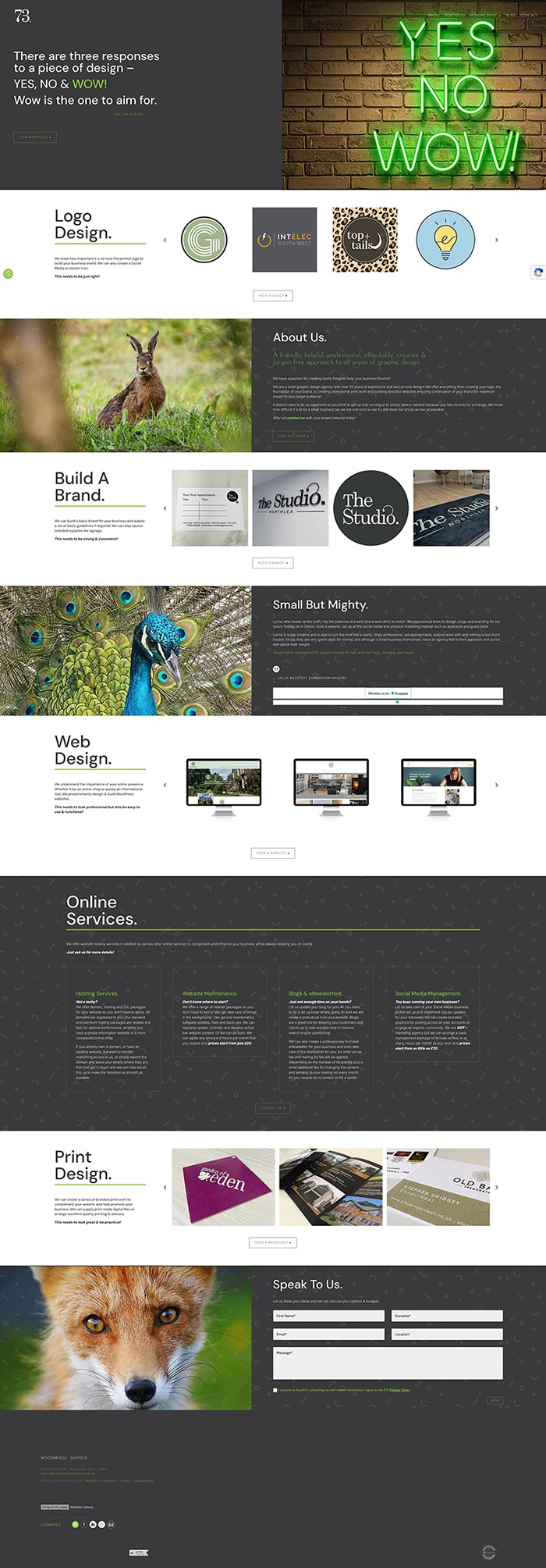
We then carried out a mini rebrand in 2025 with a website redesign in 2026. We wanted to keep the familiar brand that we already had but simply refresh the look of logo.
The new logo is not a million miles away from the original design but is simply a little twist so that it is still instantly recognisable as representing Studio73.